Client Portal
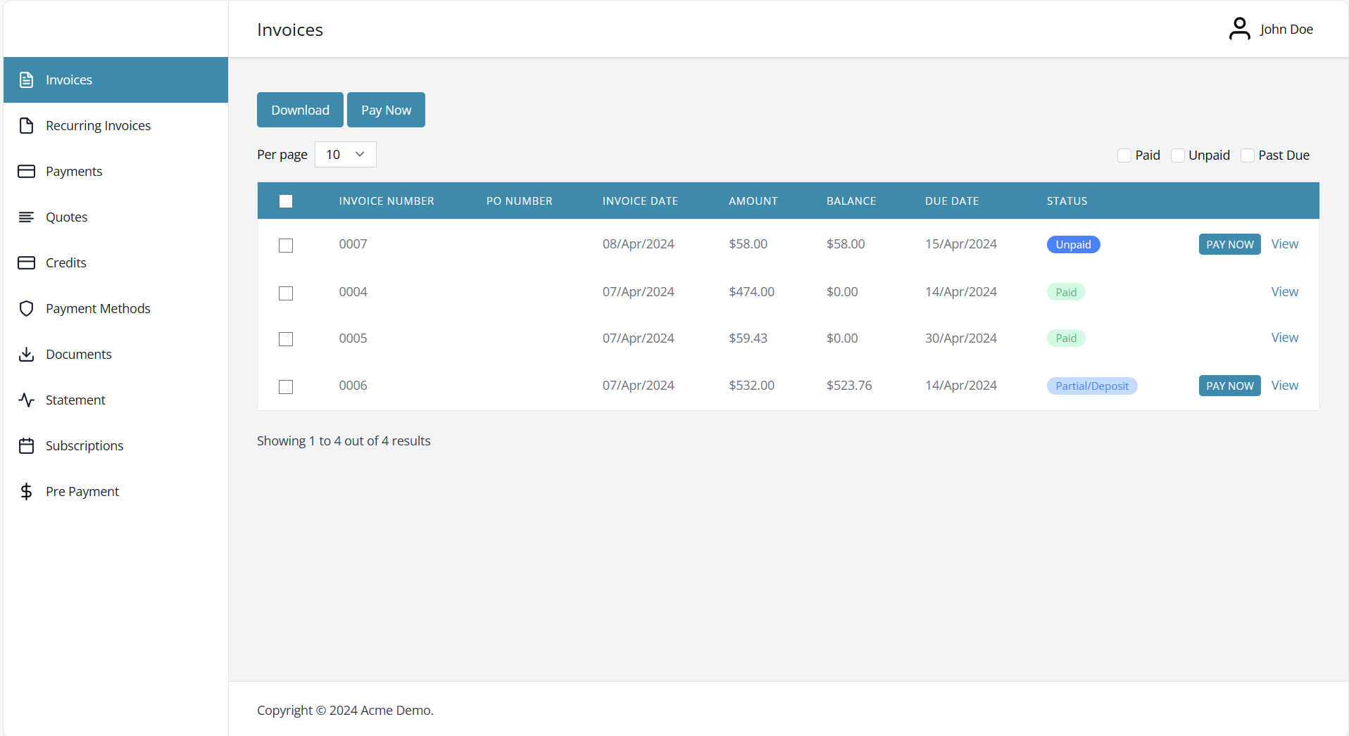
The Client Portal is the customer-facing side of Invoice Ninja — a branded, self-serve dashboard where the people you invoice can view their documents, pay online, download statements, manage saved cards, and keep their own contact details up to date. Every time you email an invoice or quote, the link in that email opens the portal, so most clients end up there without ever needing to be told it exists.
The portal is tied to Contacts, not clients. Each contact on a client record gets their own login, which is why a client with separate Accounts Payable and Operations contacts can have both people using the portal independently. Logins are enabled out of the box; you can additionally let anyone self-register as a new client under Settings > Client Portal > Registration.
The portal mirrors your Invoice Ninja configuration. Only the modules you have enabled appear to clients — turn off Quotes under Basic Settings and the Quotes tab disappears from every contact's view.
Tabs in the Client Portal
Invoices
The Invoices tab lists every invoice the client can act on or review — anything outstanding, paid, or previously sent. It's almost always the first place a client lands after clicking through from an email.
Draft invoices are deliberately excluded. An invoice only becomes visible in the portal once it has left draft status, which happens whenever you take one of the following actions from More Actions on the invoice:
- Email Invoice — sends the invoice and marks it as sent in the same step.
- Mark Sent — flips the status to sent without emailing, so the invoice appears in the portal as unpaid.
- Mark Paid — marks the invoice as paid and files it in the client's portal history.
This is the usual cause of "my client can't see the invoice" — the record is still a draft. See Invoices for the full invoice lifecycle.
Recurring Invoices

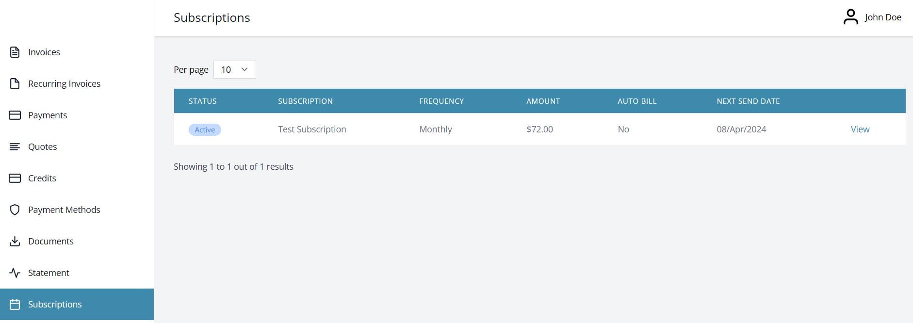
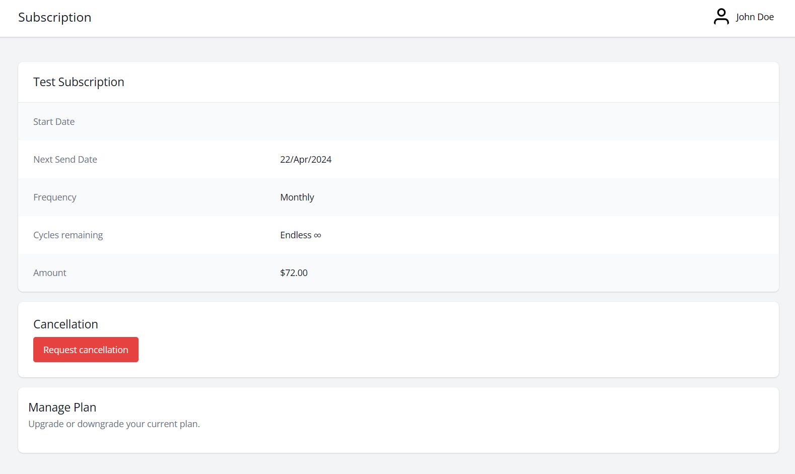
The Recurring Invoices tab gives the client visibility over any active subscription or retainer you've set up for them — frequency, start date, next send date, cycles remaining, and amount. Clicking View drills into the individual invoices that recurring template has already produced, which is handy when a client is reconciling a monthly charge. See Recurring Invoices for how to set one up.
Payments
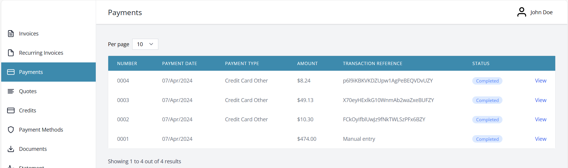
Payments shows the client's payment history — every payment you've recorded against their account, and the invoices each one was applied to. Clients tend to reach for this tab when they need a receipt or are checking whether a transfer has landed.
Quotes
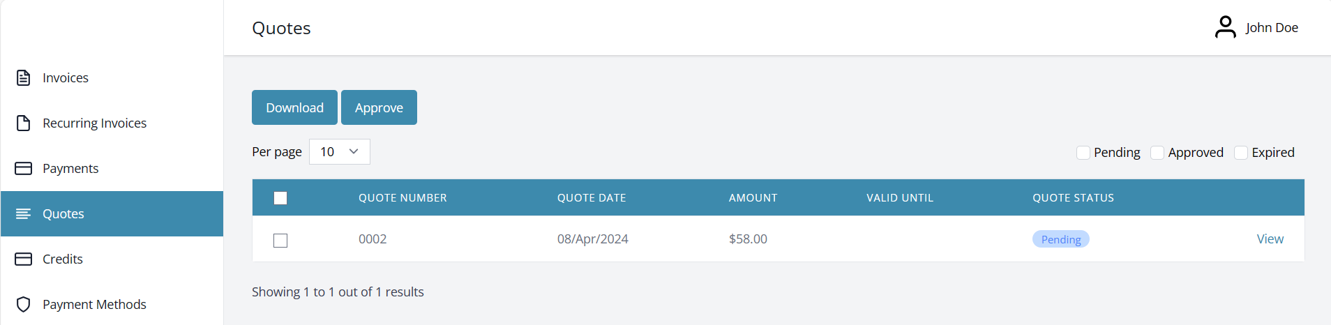
Clients use the Quotes tab to review anything you've proposed and approve it with a single click. Approval is what makes the portal do real work for you: once the quote is approved it's automatically converted to an invoice, and the client is taken straight to the payment screen for that new invoice. For the other side of this flow, see Quotes.
Credits
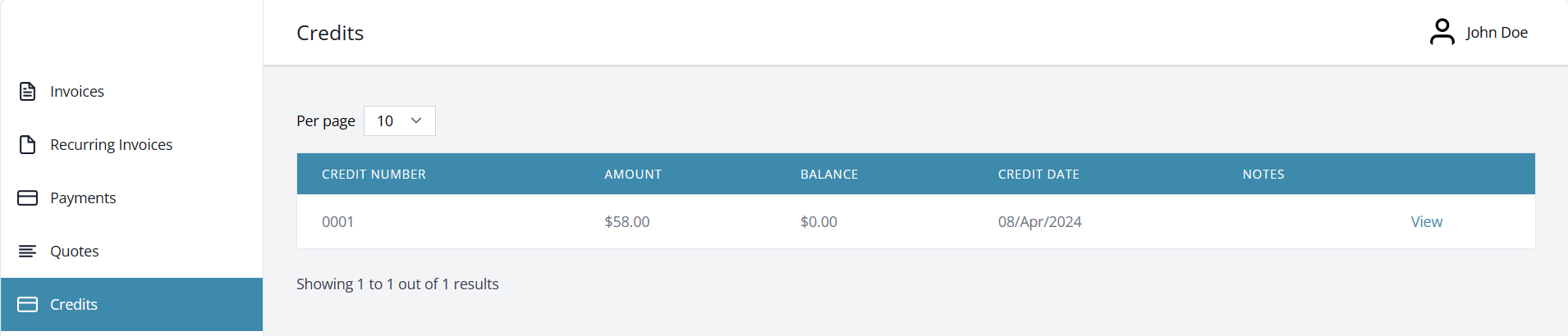
The Credits tab surfaces any credits sitting on the client's account — typically from a refunded invoice or a goodwill adjustment — so the client can see what's available to offset future invoices. See Credits for how credits are issued and applied.
Payment Methods
The Payment Methods tab is where clients review the cards and bank accounts they've saved for faster checkout, and where they can add new ones. Saving a payment method is only possible when the underlying gateway supports it — if yours doesn't, this tab simply won't offer the option. See Payment Gateways for gateway capabilities.
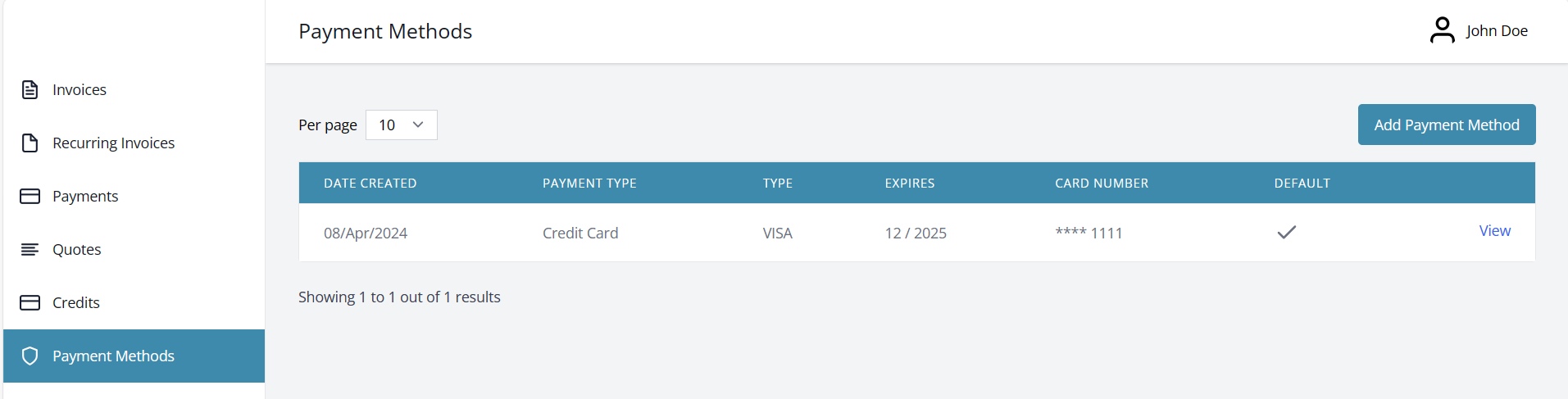
Clicking View on a saved method lets the client remove it or, if they have more than one on file, pick which should be used by default.
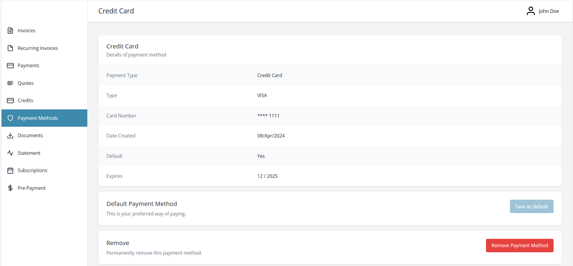
How are credit card details stored?
Card numbers are never stored by Invoice Ninja. The details are captured directly by the payment gateway, which returns a token that Invoice Ninja uses to charge the card later. This is what keeps your setup out of PCI scope. For a fuller explanation of how tokenisation works, see Stripe's overview.
How can I enter a credit card on file for my client manually?
If a client has given you card details over the phone or in person and you'd like to save them for future charges, log into the Client Portal on their behalf and go to Payment Methods > Add Payment Method. The card is captured by the gateway in exactly the same way it would be if the client had entered it themselves.
Documents
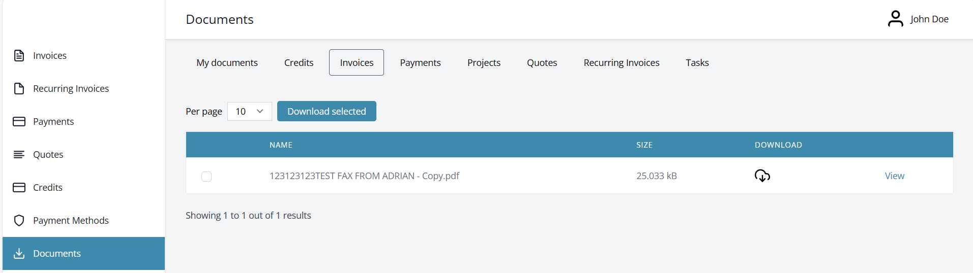
The Documents tab is where clients see any files you've chosen to share with them — typically contracts, statements of work, terms of service, or supporting documents attached to an invoice or quote. Only files you've made visible to the client will appear here; internal attachments stay hidden.
Statement
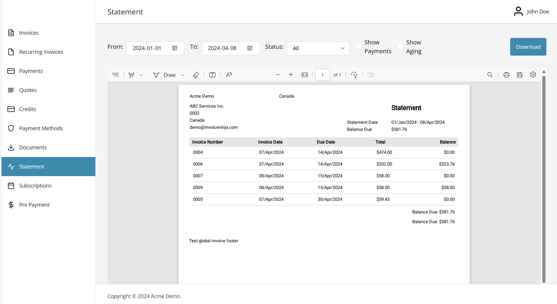
Statements let the client generate a PDF summary of their invoices and payments for any date range they choose. It's a common request around the end of a financial year or when a client is reconciling their own books, and offering it self-serve saves you running the report yourself.
Subscriptions
If the client signed up through a Payment Link, the Subscriptions tab is where they manage the resulting subscription — requesting cancellation or changing plans, depending on which options you enabled when configuring the subscription.
Pre-Payment
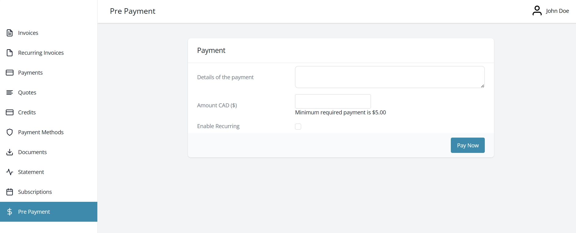
Pre-Payment lets a client pay you without attaching the payment to a specific invoice — useful for deposits, retainers, or topping up an account before work begins. The tab only appears if you've enabled it under Settings > Online Payments > Client Initiated Payments.
You can set a floor for how much a client is allowed to send under Settings > Online Payments > Client Initiated Payments > Minimum Payment Amount. If the client ticks Enable Recurring, they can set the payment to repeat a fixed number of times or indefinitely, at the frequency they choose (daily, weekly, fortnightly, and so on) — handy for clients who want to fund a retainer on a schedule without you raising an invoice each time.
What happens to the pre-payment after the client pays? Where is it stored?
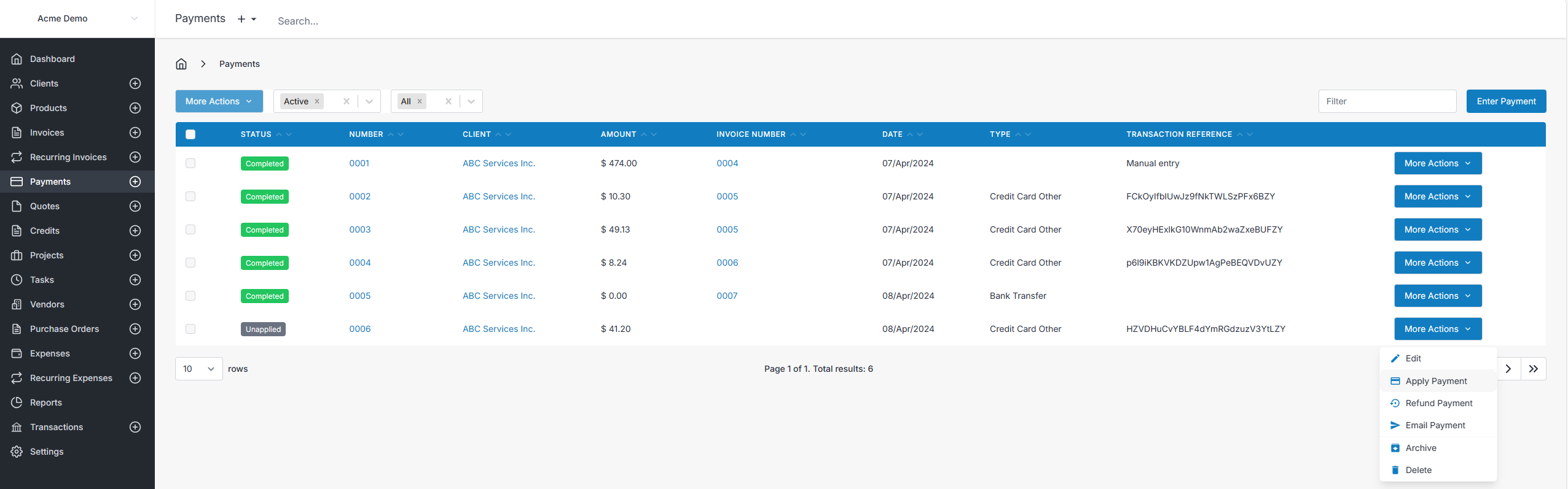
A pre-payment lands in your Payments list as an unapplied payment — money received but not yet matched to an invoice. When you're ready to use it, open the payment and choose More Actions > Apply Payment, then pick the invoice or invoices to apply it against.
Customization
You can change your self-hosted client portal's colors and selected styles by pasting CSS into the existing Custom CSS setting. Start with the example below, replace the colors with your own, or choose one of the 10 copy-and-paste themes. You do not need to edit application files.
This feature uses the existing self-hosted customization access. It does not enable Custom CSS on Invoice Ninja's hosted service or add a visual theme editor.
Apply your colors
- Sign in to Invoice Ninja as an administrator and open Settings → Client Portal → Customize.
- Copy any existing Custom CSS into a separate document so you can restore it.
- Paste the following into Custom CSS. Paste only the CSS, without
<style>tags. If you already have customizations, add this below them. - Replace the color codes as desired, then save.
- Open your client portal and refresh it to see the result. Check both a desktop window and a narrow mobile window.
[data-portal="client"] {
    --portal-primary: #176b55;
    --portal-page-background: #edf4f1;
    --portal-surface: #ffffff;
    --portal-navigation-background: #173b32;
    --portal-navigation-text: #ffffff;
    --portal-navigation-hover: #285447;
    --portal-navigation-active-background: #176b55;
    --portal-navigation-active-text: #ffffff;
    --portal-table-header-background: #173b32;
    --portal-table-header-text: #ffffff;
    --portal-button-text: #ffffff;
    --portal-button-radius: 8px;
    --portal-input-border: #a3b9af;
}
A color code such as #176b55 represents a color. Keep the punctuation and property names as shown. Remove any line you do not want to customize. Removing every added rule restores the previous appearance; existing custom CSS still applies.
Use contrasting text and background colors. After saving, check menu links, table headings, buttons, keyboard focus, and disabled controls. Changes apply immediately to visitors after they refresh; there is no separate Publish step.
What each option changes
| Option | Changes |
|---|---|
--portal-primary | Elements using the portal's primary background or text color, including most primary buttons. Defaults to the existing primary color setting. |
--portal-page-background | The main background around signed-in portal content. |
--portal-surface | The shared signed-in header and footer backgrounds. |
--portal-navigation-background | The menu behind navigation links, on desktop and mobile. |
--portal-navigation-text | Inactive navigation link text. |
--portal-navigation-hover | Inactive navigation link background when hovered. |
--portal-navigation-active-background | The selected navigation link background. Defaults to the portal primary color. |
--portal-navigation-active-text | The selected navigation link text. |
--portal-table-header-background | Entity table headings that normally use the primary color. |
--portal-table-header-text | Entity table headings that normally use white text. |
--portal-button-text | Primary button text. |
--portal-button-radius | Standard button corners. Buttons with an explicit corner style keep that style. Use a length such as 4px or 8px. |
--portal-input-border | Borders on fields using the shared input style. |
These options cover shared portal elements, not every color on every page. For example, navigation icons, the logo area, status badges, and task detail subheadings keep their existing colors unless you target them separately. This is not a complete dark theme.
Copy-and-paste themes
Choose one of these 10 themes for a ready-made starting point. Each CSS block includes all 13 portal variables, so you can copy a complete theme without assembling individual settings.
- Open Settings → Client Portal → Customize on your self-hosted installation.
- Back up your existing Custom CSS.
- Use the copy button on your chosen CSS block, then paste it into Custom CSS, without
<style>tags. Replace the starter color block or a previous theme block with your choice. Keep unrelated customizations you still need. - Save, then refresh the client portal. Check desktop and mobile views, buttons, navigation, and forms.
Use one theme block at a time. Existing rules that style individual elements can still override these variables; see If a change does not appear. To switch themes, replace the entire theme block with another one below.
All themes keep the page, header, and footer light so they work with the portal's existing text colors. They style the shared elements described in What each option changes; navigation icons, the logo area, and status badges retain their existing styling.
Click a preview to open the full-size screenshot, or a theme name to jump to its copy-and-paste CSS.
| Theme | Preview | Appearance |
|---|---|---|
| Ocean Blue | 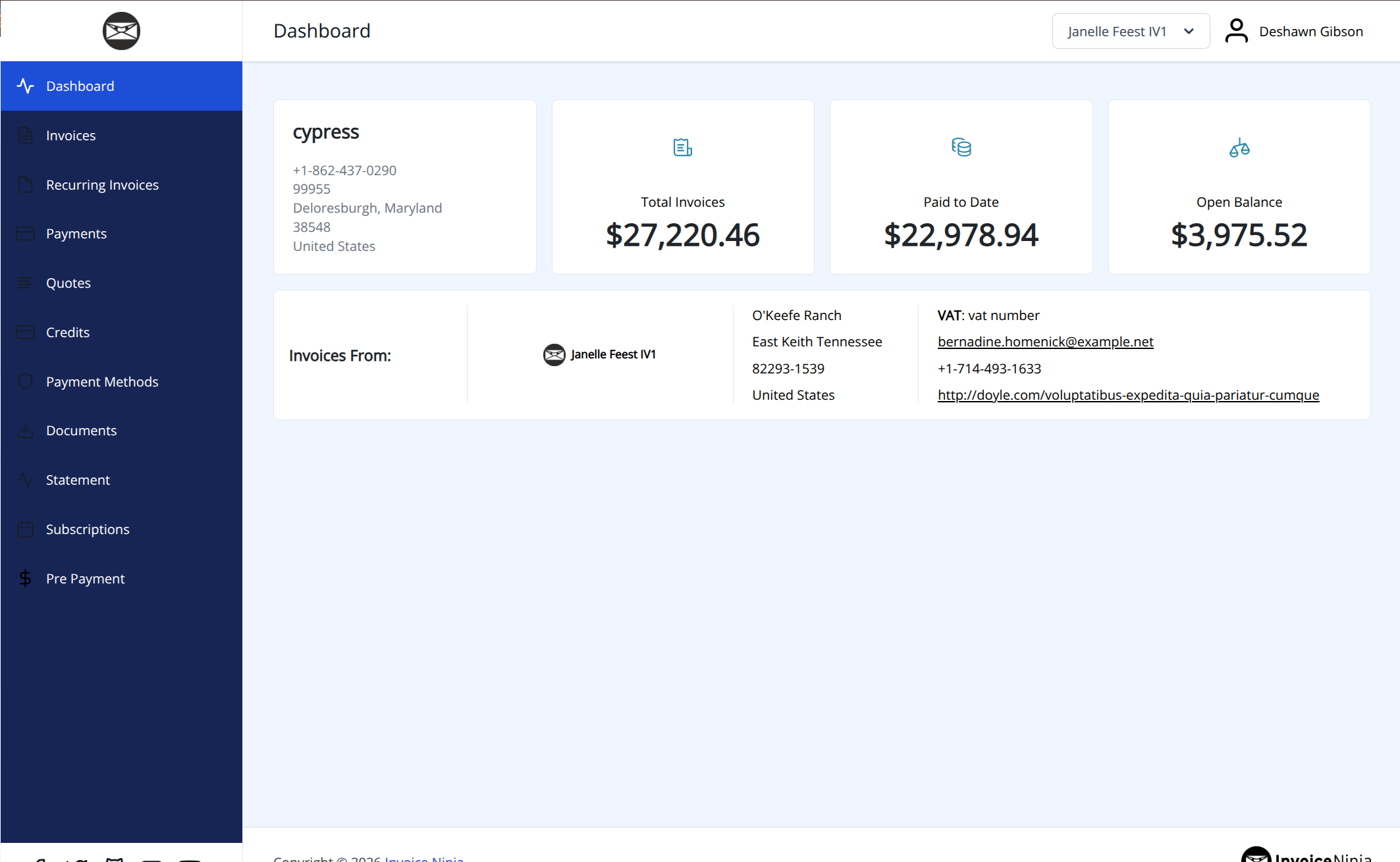 | Deep blue navigation, a pale blue page, and crisp blue buttons. Button corners: 6px. |
| Forest Green | 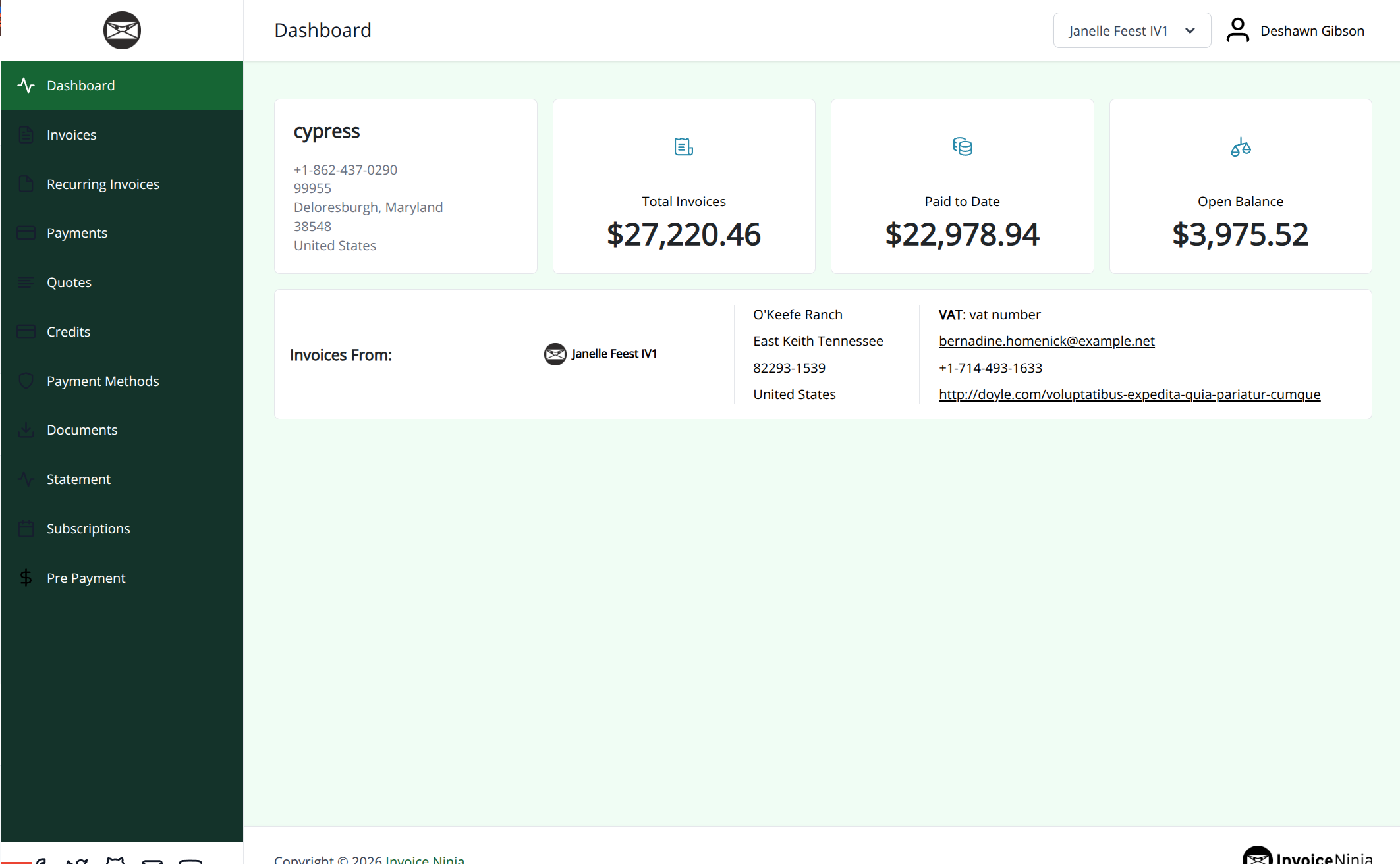 | Evergreen navigation with soft green surroundings and rounded buttons. Button corners: 8px. |
| Royal Violet | 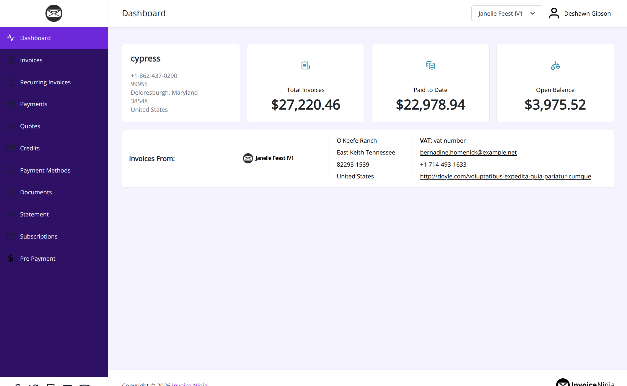 | Rich violet accents, a pale lavender page, and softly rounded buttons. Button corners: 10px. |
| Warm Terracotta | 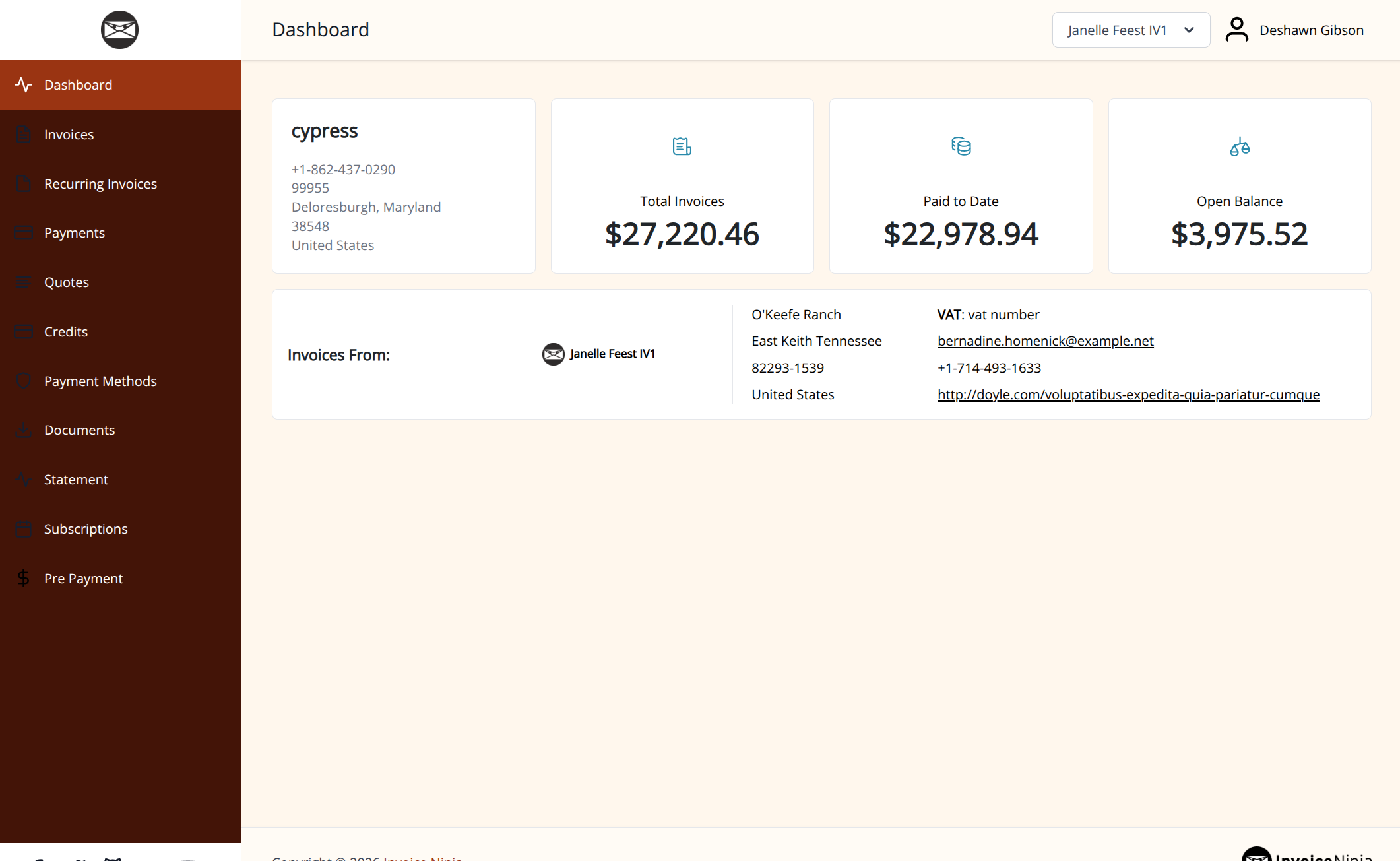 | Earthy red buttons and brown navigation against a warm cream page. Button corners: 6px. |
| Graphite | 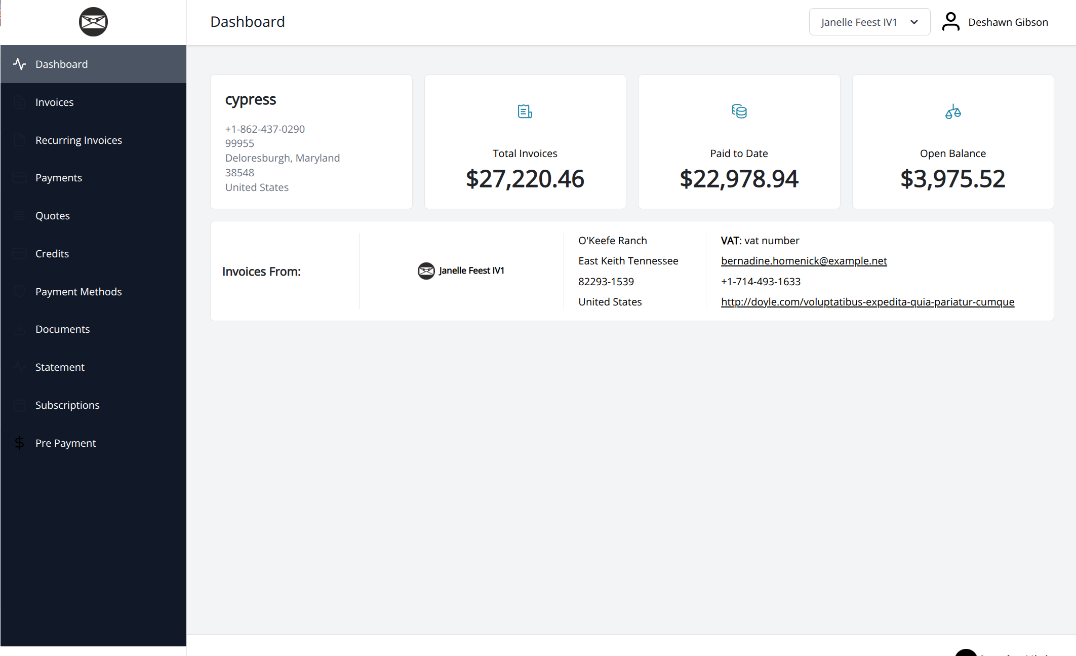 | Neutral charcoal navigation, gray accents, and square button corners. Button corners: Square. |
| Coastal Teal | 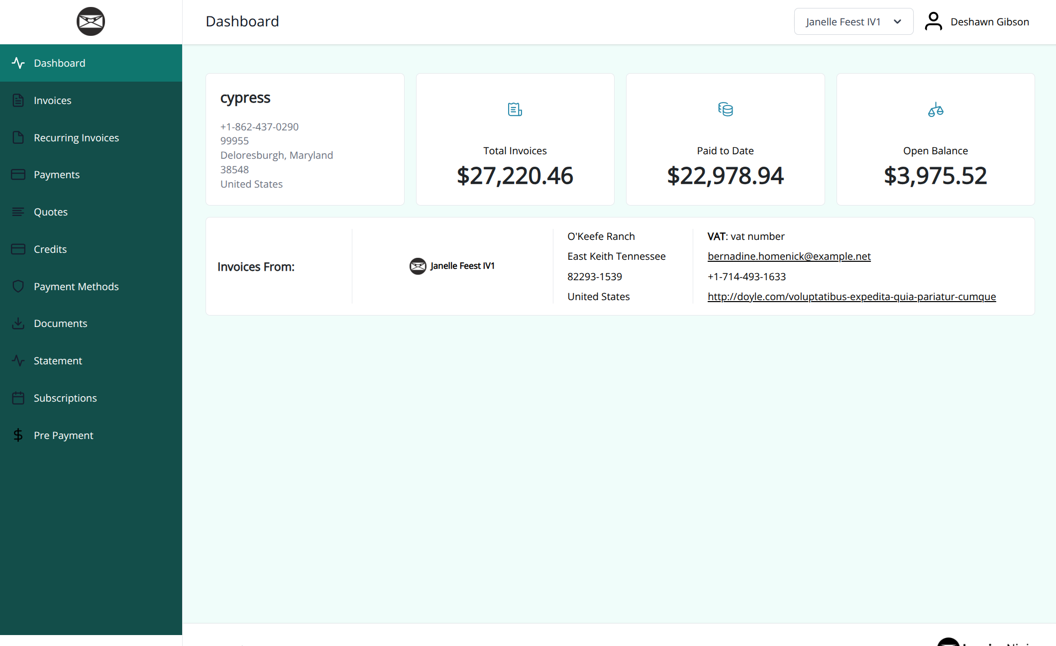 | Dark teal navigation, fresh aqua surroundings, and pill-shaped standard buttons. Button corners: Pill-shaped. |
| Burgundy | 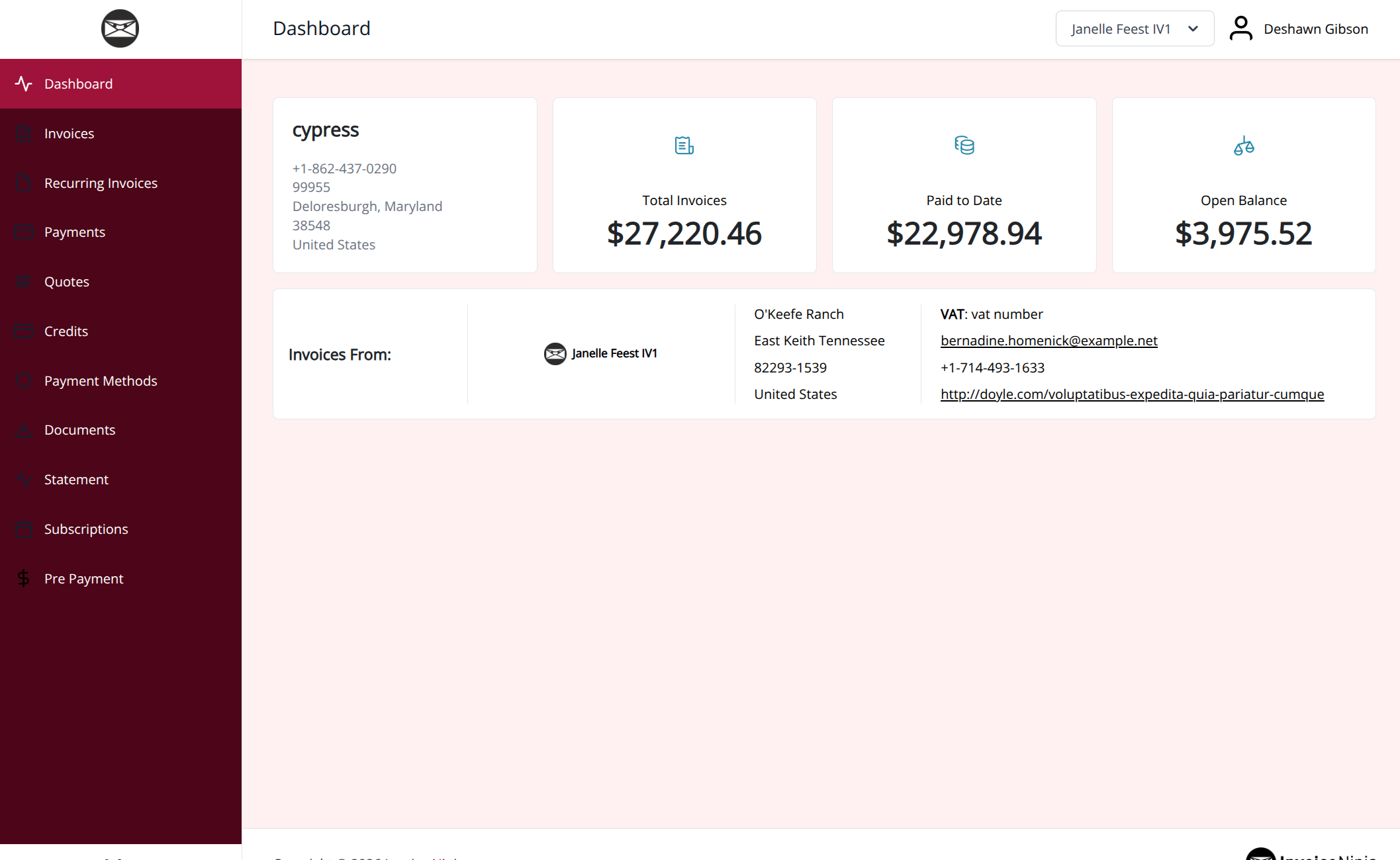 | Wine-colored navigation and buttons with a pale rose page background. Button corners: 4px. |
| Golden Sand | 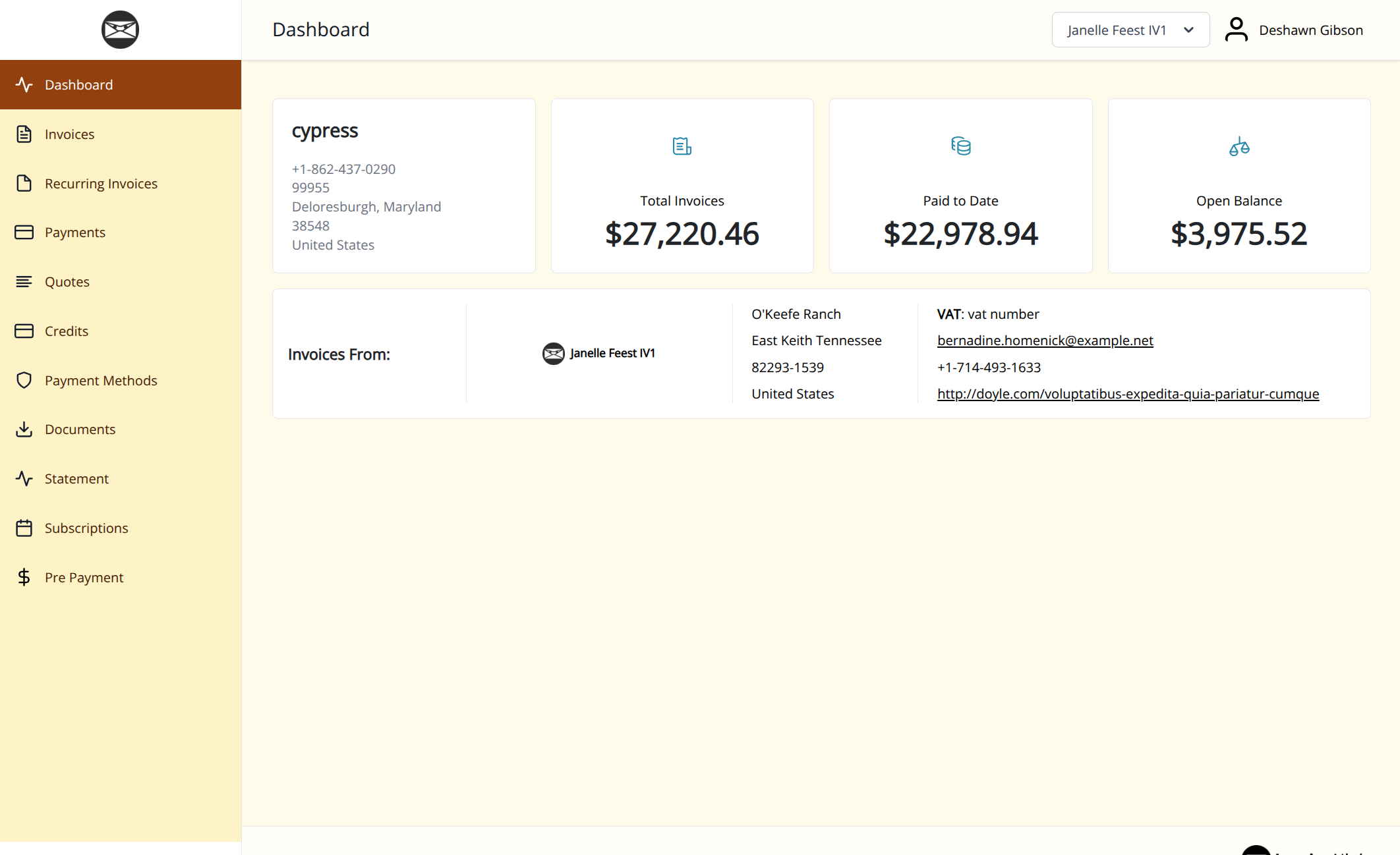 | Light sand navigation, dark brown text, and amber-brown buttons. Button corners: 8px. |
| Nordic Slate | 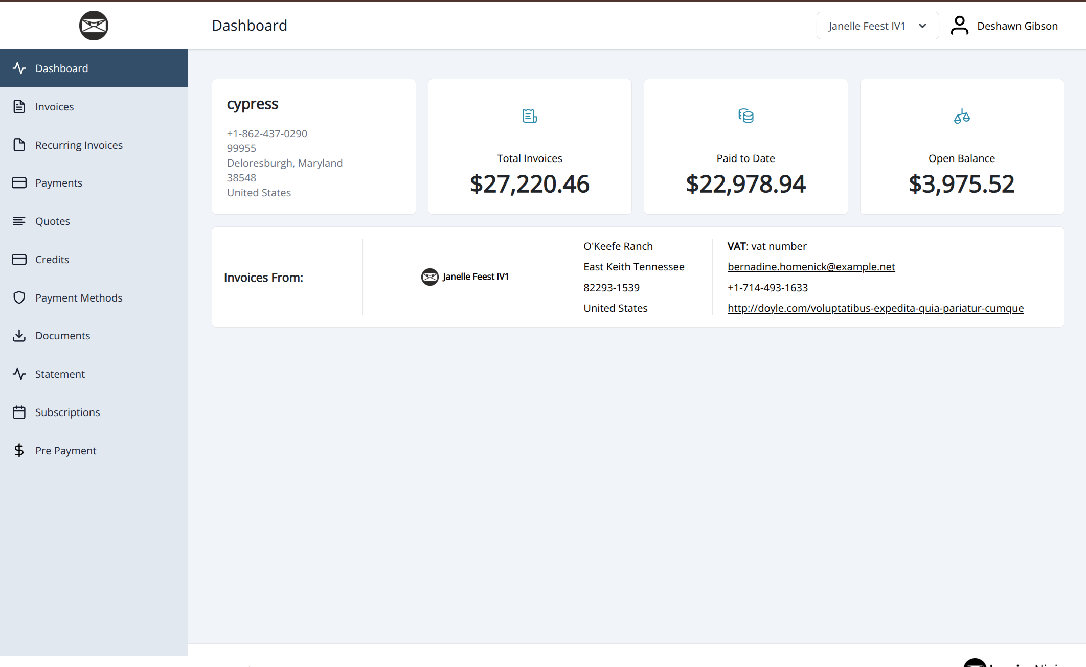 | Light slate navigation and muted blue accents for a restrained appearance. Button corners: 4px. |
| Rose Garden | 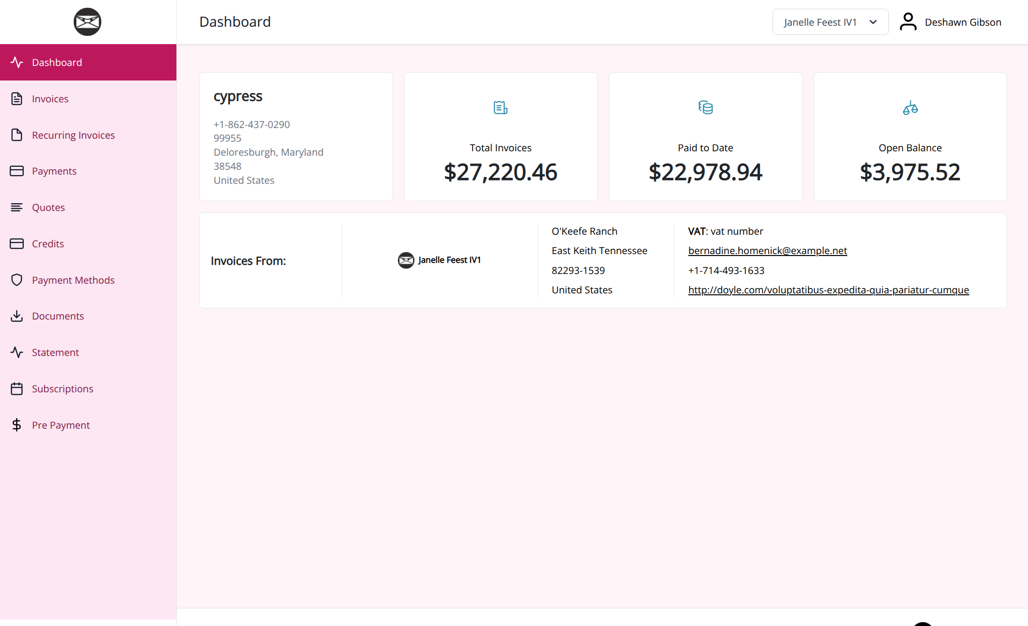 | Light pink navigation, deep rose buttons, and generous button curves. Button corners: 12px. |
Ocean Blue
Deep blue navigation, a pale blue page, and crisp blue buttons.
[data-portal="client"] {
    --portal-primary: #1d4ed8;
    --portal-page-background: #eff6ff;
    --portal-surface: #ffffff;
    --portal-navigation-background: #172554;
    --portal-navigation-text: #ffffff;
    --portal-navigation-hover: #1e3a8a;
    --portal-navigation-active-background: #1d4ed8;
    --portal-navigation-active-text: #ffffff;
    --portal-table-header-background: #172554;
    --portal-table-header-text: #ffffff;
    --portal-button-text: #ffffff;
    --portal-button-radius: 6px;
    --portal-input-border: #64748b;
}
Forest Green
Evergreen navigation with soft green surroundings and rounded buttons.
[data-portal="client"] {
    --portal-primary: #166534;
    --portal-page-background: #f0fdf4;
    --portal-surface: #ffffff;
    --portal-navigation-background: #14332a;
    --portal-navigation-text: #ffffff;
    --portal-navigation-hover: #245343;
    --portal-navigation-active-background: #166534;
    --portal-navigation-active-text: #ffffff;
    --portal-table-header-background: #14332a;
    --portal-table-header-text: #ffffff;
    --portal-button-text: #ffffff;
    --portal-button-radius: 8px;
    --portal-input-border: #648273;
}
Royal Violet
Rich violet accents, a pale lavender page, and softly rounded buttons.
[data-portal="client"] {
    --portal-primary: #6d28d9;
    --portal-page-background: #f5f3ff;
    --portal-surface: #ffffff;
    --portal-navigation-background: #2e1065;
    --portal-navigation-text: #ffffff;
    --portal-navigation-hover: #4c1d95;
    --portal-navigation-active-background: #6d28d9;
    --portal-navigation-active-text: #ffffff;
    --portal-table-header-background: #4c1d95;
    --portal-table-header-text: #ffffff;
    --portal-button-text: #ffffff;
    --portal-button-radius: 10px;
    --portal-input-border: #84739c;
}
Warm Terracotta
Earthy red buttons and brown navigation against a warm cream page.
[data-portal="client"] {
    --portal-primary: #9a3412;
    --portal-page-background: #fff7ed;
    --portal-surface: #fffbf5;
    --portal-navigation-background: #431407;
    --portal-navigation-text: #ffffff;
    --portal-navigation-hover: #7c2d12;
    --portal-navigation-active-background: #9a3412;
    --portal-navigation-active-text: #ffffff;
    --portal-table-header-background: #7c2d12;
    --portal-table-header-text: #ffffff;
    --portal-button-text: #ffffff;
    --portal-button-radius: 6px;
    --portal-input-border: #947665;
}
Graphite
Neutral charcoal navigation, gray accents, and square button corners.
[data-portal="client"] {
    --portal-primary: #374151;
    --portal-page-background: #f3f4f6;
    --portal-surface: #ffffff;
    --portal-navigation-background: #111827;
    --portal-navigation-text: #ffffff;
    --portal-navigation-hover: #374151;
    --portal-navigation-active-background: #4b5563;
    --portal-navigation-active-text: #ffffff;
    --portal-table-header-background: #1f2937;
    --portal-table-header-text: #ffffff;
    --portal-button-text: #ffffff;
    --portal-button-radius: 0px;
    --portal-input-border: #6b7280;
}
Coastal Teal
Dark teal navigation, fresh aqua surroundings, and pill-shaped standard buttons.
[data-portal="client"] {
    --portal-primary: #0f766e;
    --portal-page-background: #f0fdfa;
    --portal-surface: #ffffff;
    --portal-navigation-background: #134e4a;
    --portal-navigation-text: #ffffff;
    --portal-navigation-hover: #115e59;
    --portal-navigation-active-background: #0f766e;
    --portal-navigation-active-text: #ffffff;
    --portal-table-header-background: #134e4a;
    --portal-table-header-text: #ffffff;
    --portal-button-text: #ffffff;
    --portal-button-radius: 999px;
    --portal-input-border: #58817d;
}
Burgundy
Wine-colored navigation and buttons with a pale rose page background.
[data-portal="client"] {
    --portal-primary: #9f1239;
    --portal-page-background: #fff1f2;
    --portal-surface: #ffffff;
    --portal-navigation-background: #4c0519;
    --portal-navigation-text: #ffffff;
    --portal-navigation-hover: #881337;
    --portal-navigation-active-background: #9f1239;
    --portal-navigation-active-text: #ffffff;
    --portal-table-header-background: #881337;
    --portal-table-header-text: #ffffff;
    --portal-button-text: #ffffff;
    --portal-button-radius: 4px;
    --portal-input-border: #99717b;
}
Golden Sand
Light sand navigation, dark brown text, and amber-brown buttons.
[data-portal="client"] {
    --portal-primary: #92400e;
    --portal-page-background: #fffbeb;
    --portal-surface: #fffdf7;
    --portal-navigation-background: #fef3c7;
    --portal-navigation-text: #451a03;
    --portal-navigation-hover: #fde68a;
    --portal-navigation-active-background: #92400e;
    --portal-navigation-active-text: #ffffff;
    --portal-table-header-background: #78350f;
    --portal-table-header-text: #ffffff;
    --portal-button-text: #ffffff;
    --portal-button-radius: 8px;
    --portal-input-border: #967443;
}
Nordic Slate
Light slate navigation and muted blue accents for a restrained appearance.
[data-portal="client"] {
    --portal-primary: #334e68;
    --portal-page-background: #f1f5f9;
    --portal-surface: #ffffff;
    --portal-navigation-background: #e2e8f0;
    --portal-navigation-text: #1e293b;
    --portal-navigation-hover: #cbd5e1;
    --portal-navigation-active-background: #334e68;
    --portal-navigation-active-text: #ffffff;
    --portal-table-header-background: #334e68;
    --portal-table-header-text: #ffffff;
    --portal-button-text: #ffffff;
    --portal-button-radius: 4px;
    --portal-input-border: #64748b;
}
Rose Garden
Light pink navigation, deep rose buttons, and generous button curves.
[data-portal="client"] {
    --portal-primary: #be185d;
    --portal-page-background: #fff5f8;
    --portal-surface: #ffffff;
    --portal-navigation-background: #fce7f3;
    --portal-navigation-text: #831843;
    --portal-navigation-hover: #fbcfe8;
    --portal-navigation-active-background: #be185d;
    --portal-navigation-active-text: #ffffff;
    --portal-table-header-background: #9d174d;
    --portal-table-header-text: #ffffff;
    --portal-button-text: #ffffff;
    --portal-button-radius: 12px;
    --portal-input-border: #a16b83;
}
Style a particular area
A selector names the part of the page you want to change. The portal provides stable names so your CSS does not need to depend on its layout or utility classes.
For example, add a border underneath the header:
[data-portal="client"] [data-portal-target="header"] {
    border-bottom: 2px solid #176b55;
}
Change the headings only in the invoice table:
[data-portal="client"] [data-portal-table="invoices"] {
    --portal-table-header-background: #244b72;
}
The following names are supported. Start each selector with [data-portal="client"] as in the examples, to keep your changes within the client portal.
| Target | Selector |
|---|---|
| Signed-in layout | [data-portal-target="shell"] |
| Header | [data-portal-target="header"] |
| Sidebar | [data-portal-target="sidebar"] |
| Navigation menu | [data-portal-target="navigation"] |
| Navigation links | [data-portal-target="navigation-link"] |
| Selected navigation link | [data-portal-target="navigation-link"][aria-current="page"] |
| Company logo in the sidebar | [data-portal-target="logo"] |
| Main content | [data-portal-target="content"] |
| Page heading area | [data-portal-target="page-header"] |
| Footer | [data-portal-target="footer"] |
| Entity tables | [data-portal-target="table"] |
| Table pagination, when shown | [data-portal-target="pagination"] |
| Standard buttons | .button |
| Button styles | .button-primary, .button-secondary, .button-danger, .button-link |
| Shared form controls | .input, .input-label, .form-select, .form-checkbox |
| Alerts and validation | .alert, .validation |
| Status badges | .badge |
To select only one sidebar, append [data-portal-variant="desktop"] or [data-portal-variant="mobile"] to its target. Both variants can exist in the page, even when only one is visible.
Individual table names are invoices, quotes, payments, credits, recurring-invoices, payment-methods, documents, projects, tasks, subscriptions, subscriptions-recurring-invoices, and purchase-orders. Task detail tables also use tasks. You can use ordinary CSS descendants such as thead, tbody, tr, and td within a table target.
Keep existing selectors if they already work. The new names are additional hooks; existing classes and IDs remain available.
More customization examples
Add these examples below your portal-wide rules in Custom CSS. Each example can be used on its own. Replace the colors and sizes to match your branding, and keep the [data-portal="client"] prefix so the rules stay within the portal.
Give navigation links rounded corners
This changes the shape and spacing of links in both navigation menus. The navigation color variables in the starter example still control their colors.
[data-portal="client"] [data-portal-target="navigation-link"] {
    border-radius: 6px;
    margin-block: 4px;
}
Underline the selected navigation link
Use aria-current="page" to style the current page's link. An underline gives clients another way to identify the selected page alongside its background color.
[data-portal="client"] [data-portal-target="navigation-link"][aria-current="page"] {
    text-decoration: underline;
    text-underline-offset: 4px;
}
Use different heading colors for invoices and quotes
Set table-heading variables on a named table to override the portal-wide values for that table only. Other tables keep the values from your root rule.
[data-portal="client"] [data-portal-table="invoices"] {
    --portal-table-header-background: #244b72;
    --portal-table-header-text: #ffffff;
}

[data-portal="client"] [data-portal-table="quotes"] {
    --portal-table-header-background: #654080;
    --portal-table-header-text: #ffffff;
}
Add row separators to the invoice table
Ordinary CSS table selectors work inside a named table target. This adds a light border beneath the body cells in the invoice table.
[data-portal="client"] [data-portal-table="invoices"] tbody td {
    border-bottom: 1px solid #d5e2dc;
}
Style the mobile sidebar separately
Append the mobile variant to the sidebar selector when a change should apply only to that sidebar. This adds an inset border without changing its width. Use desktop instead of mobile to target the desktop sidebar.
[data-portal="client"] [data-portal-target="sidebar"][data-portal-variant="mobile"] {
    box-shadow: inset 0 0 0 1px #a3b9af;
}
The variant identifies a sidebar, rather than a screen width. For a change to another element based on the window width, use a media query. For example, this reduces the page heading area's bottom margin in windows up to 640 pixels wide:
@media (max-width: 640px) {
    [data-portal="client"] [data-portal-target="page-header"] {
        margin-bottom: 12px;
    }
}
Make shared input borders easier to see on focus
This example adds an outline when a shared text input or select receives focus, helping keyboard users see which control they are editing. Choose an outline color that contrasts with your field backgrounds, and preserve visible focus indicators when adding other styles.
[data-portal="client"] .input:focus,
[data-portal="client"] .form-select:focus {
    outline: 2px solid #176b55;
    outline-offset: 2px;
}
Where your changes apply
Company Custom CSS is used on the login pages. Signed-in pages use the client's Custom CSS if set, otherwise the group's, otherwise the company's. These CSS fields replace one another; they are not combined. If a client's portal looks different, check its client and group settings for an override.
Login pages have the [data-portal="client"] root and shared component styles, but do not have the signed-in sidebar, header, or table targets. The variables only affect elements present on that page.
Portal CSS does not change invoice PDFs, email designs, or the contents of payment-provider frames. It also does not recolor image files. Customizing those requires their separate design or provider settings.
If a change does not appear
- Confirm you are using a self-hosted installation with access to Custom CSS.
- Refresh the client portal after saving. Check whether a client or group override replaces the company CSS.
- Check that each declaration ends with a semicolon and each block closes with
}. - Look for older CSS rules that set the same colors, especially rules containing
!important. - Check the option's coverage above. For a specific element, use its named target instead.
To undo your changes, remove the rules you added, restore your saved CSS if needed, save, and refresh the portal.